Simplification of the Proposal
50% reduction in legal claims related to the proposal.

Client
MRV & Co
Role
Product Stage:
Growth
Year
2023
01
Challenge
The proposal screen was confusing for clients, brokers, and businesses, generating insecurity in negotiations and legal risks. Poorly structured information made it difficult to read the values and compromised decision-making at the most sensitive moment of the purchase.
02
Solution
Based on qualitative research, five-second tests, and usability sessions, I restructured the proposal based on familiar mental models and design heuristics. I reorganized content, highlighted essential values, and simplified communication to reduce ambiguity without increasing technical complexity.
03
Results
The improvements reduced legal claims related to the proposal by 50%, increased the security of brokers, and helped clients better understand what they were contracting. The solution also became a strategic foundation for future developments in the negotiation journey.
Trade-offs
Upon observing the tests, I chose to intervene in the language and structure, rather than redesigning the entire stage. The decision required balancing financial clarity with technical constraints and discussions with the legal team, reducing ambiguity without increasing complexity.
Overview
At MRV, the purchase proposal is a decisive step in the customer's journey. It is the moment when the financial conditions are presented and the negotiation begins. Despite its importance, this step was one of the least understood by customers, brokers, and even by MRV's internal teams.
The affected customer does not understand what they are agreeing to and how much they will actually pay. Meanwhile, the broker is uncertain about the flexibility to negotiate and their autonomy to modify the values.
The proposal screen generated insecurity, frequent doubts, and even legal risks. Brokers often avoided showing it to customers because they did not know how to explain the values clearly, fearing it would hinder the negotiation. In some cases, misunderstandings reached the legal team, creating conflicts at the time of signing the contract.
"I avoid showing this screen to the customer because they ask questions that I don’t even know how to answer."
User Research and Testing
To validate the hypothesis and map the main pain points, I planned and conducted a comprehensive research phase using qualitative and behavioral methods, including:
Five-second tests, evaluating the initial clarity of the screen
Moderated usability tests, focusing on the interpretation of the values and task completion
Open surveys, to capture spontaneous perceptions and language used by the participants
I was responsible for all stages of the process, including desk research, defining the epic mission, aligning with stakeholders on critical points, creating the script, conducting the sessions, analyzing the findings, and visually presenting the results to the team and key stakeholders.
“Part of the documentation used to present the methodology and the data collected.”
The research revealed several issues, including:
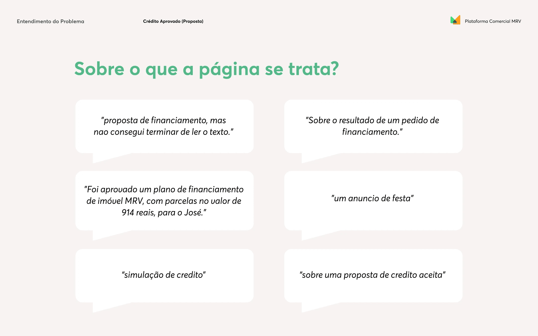
📊 In the 5s test, few participants correctly identified the purpose of the screen. Responses varied between "simulation", "credit result", "financing proposal", and even "party announcement";
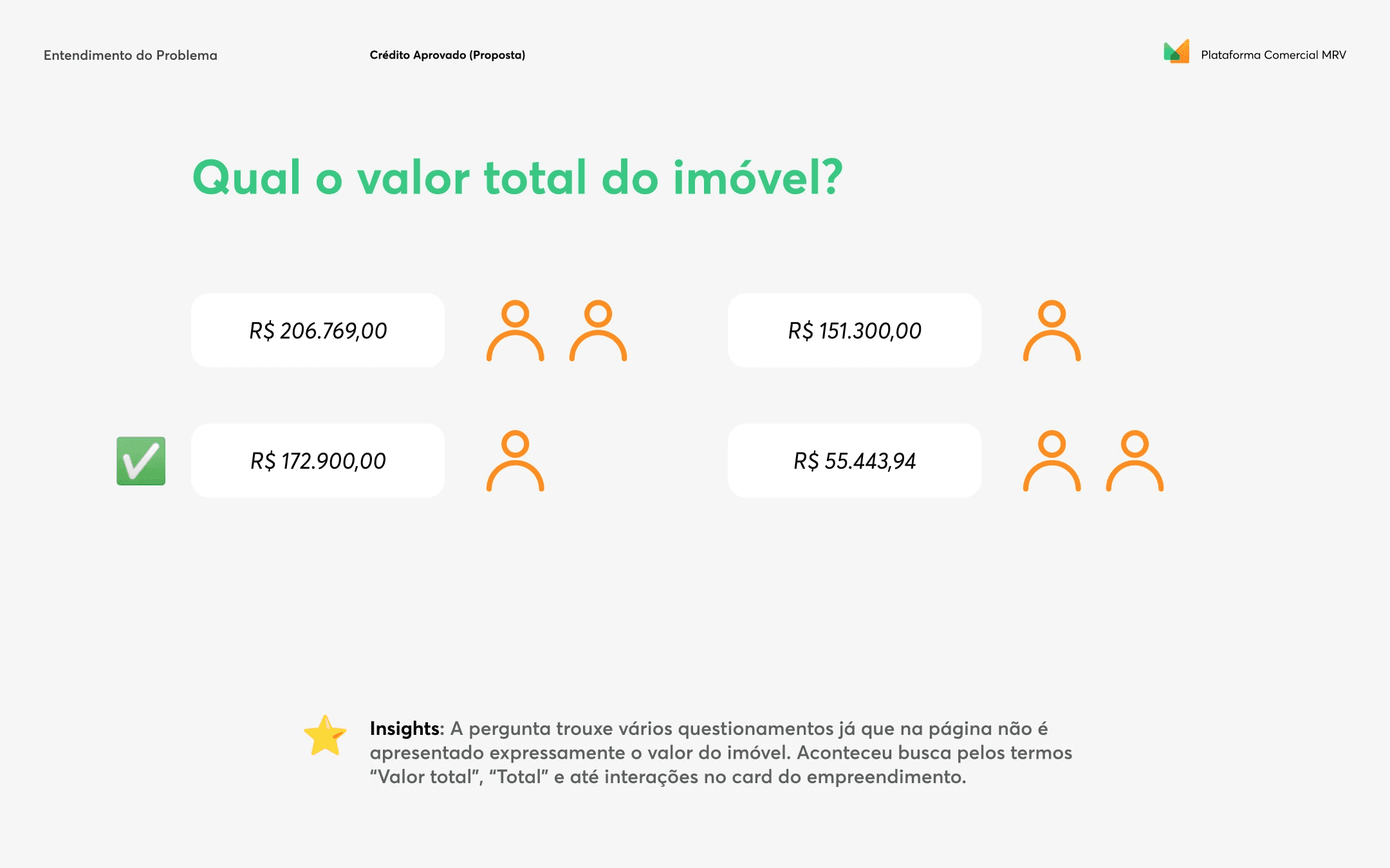
📊 Only 1 out of 6 participants correctly found the total property value. The others confused it with down payment, installments, or looked for the information in out-of-context fields;
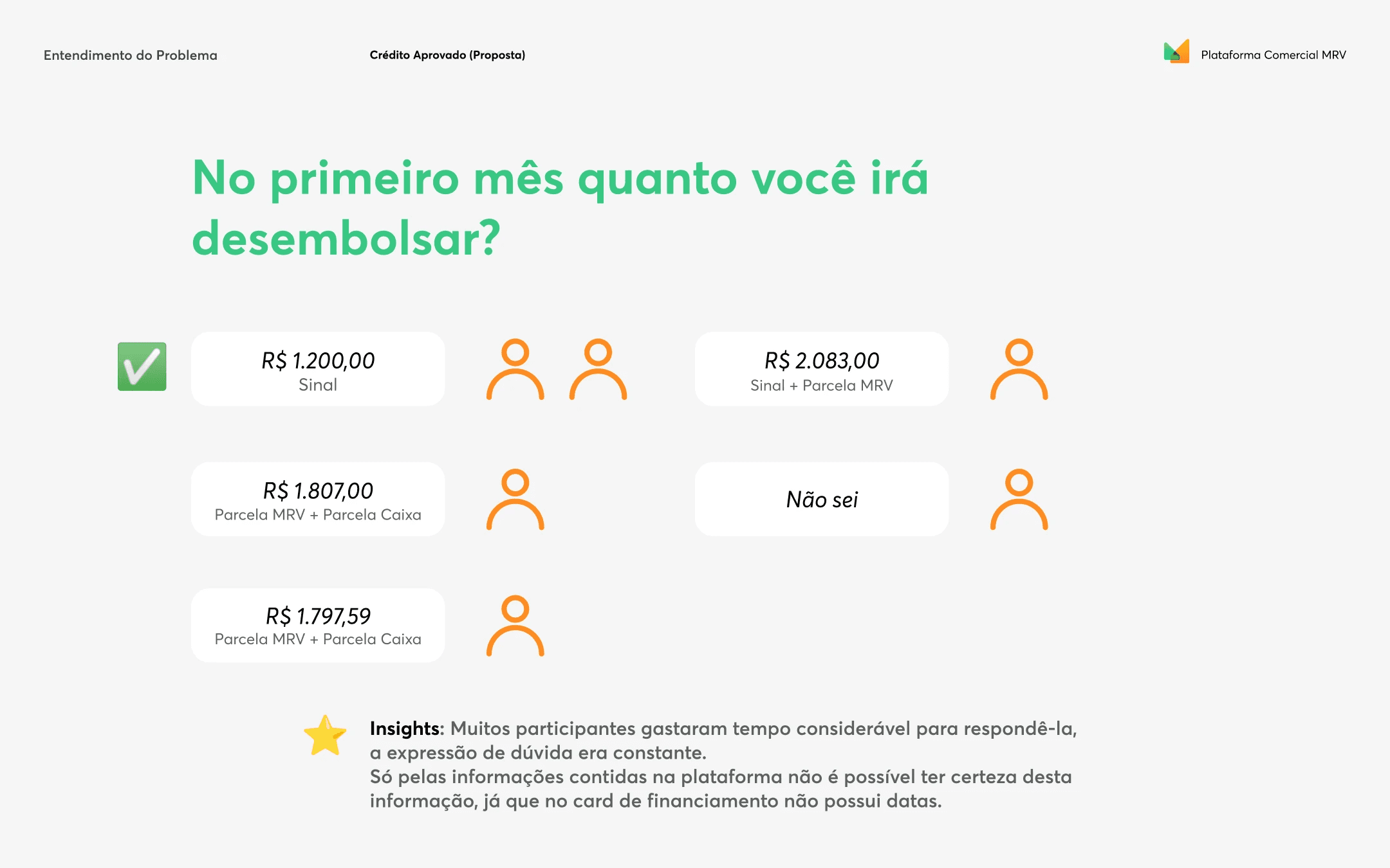
📊 All participants could not indicate the monthly disbursement amount, demonstrating uncertainty about when the payment would start and what the initial value would be;
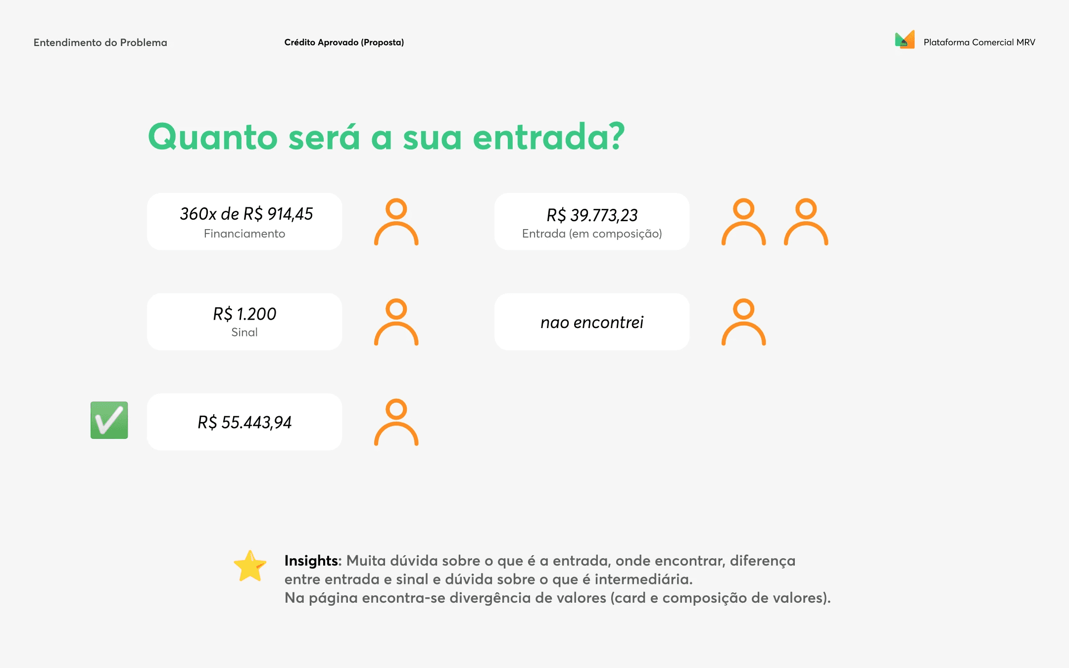
These findings reinforced the need for change. The proposal was unclear, overloaded with poorly structured information, and did not support the decision-making process.
Strategy and Execution
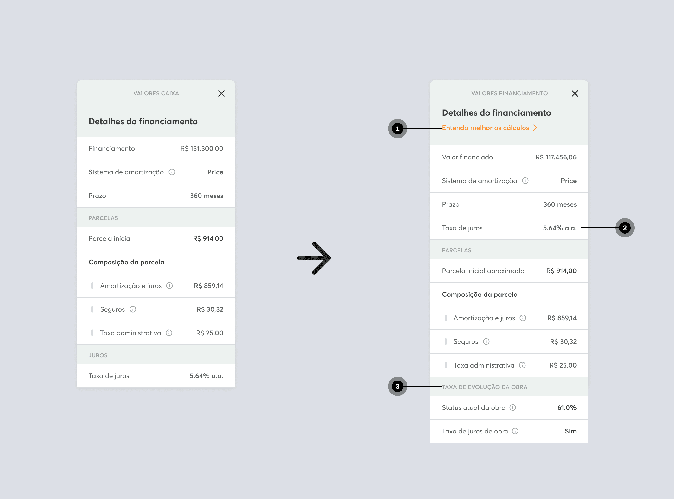
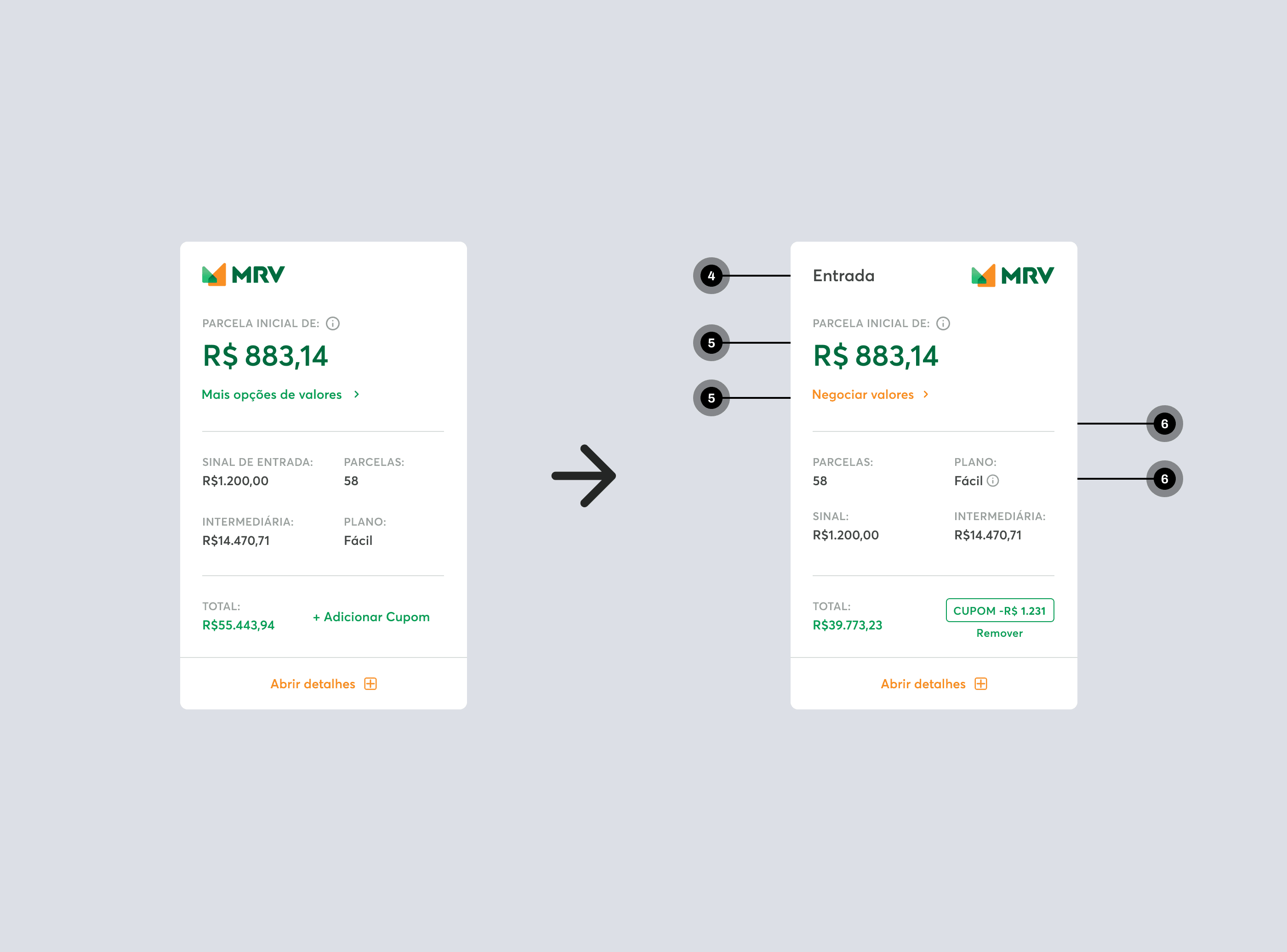
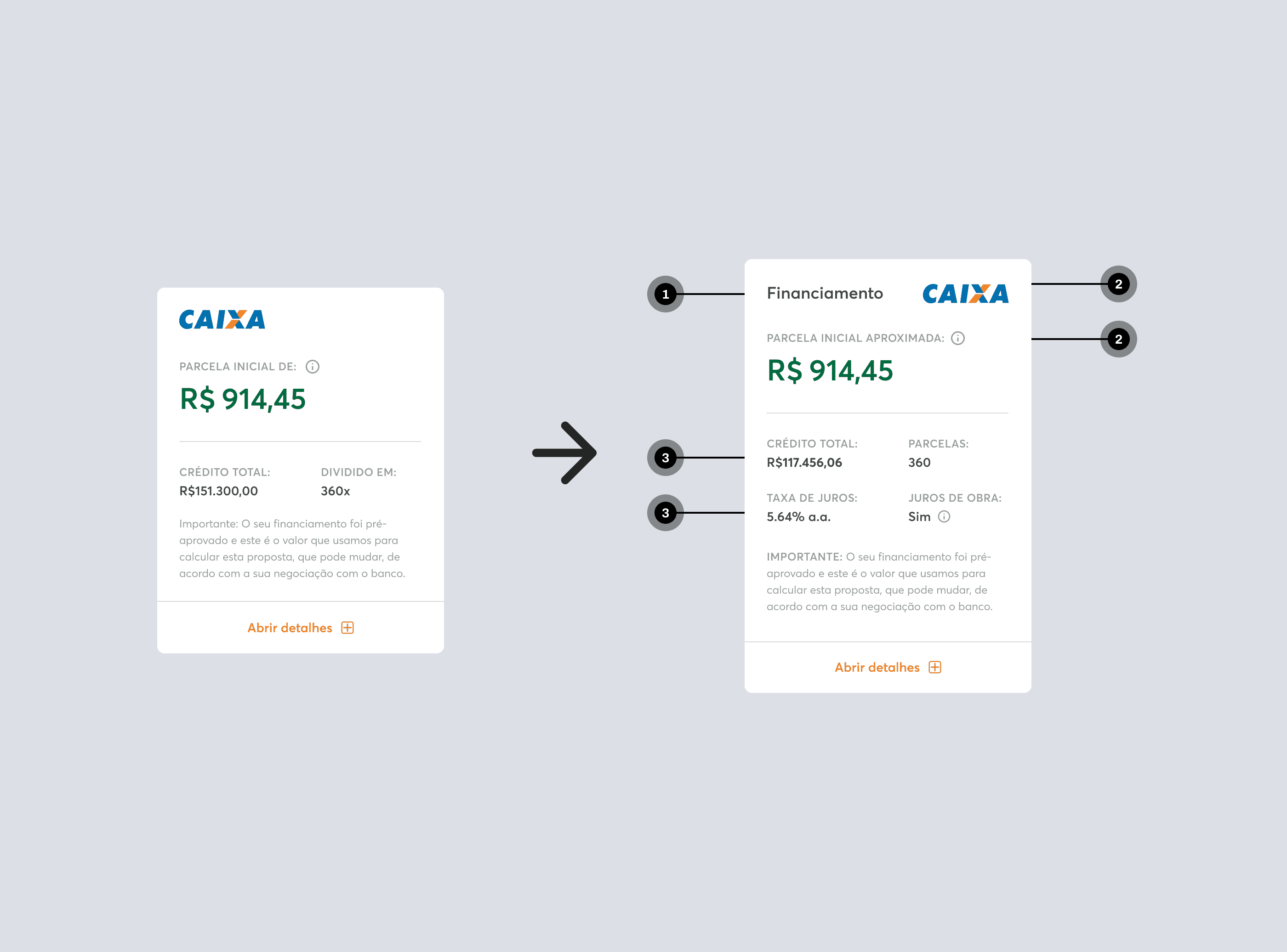
Based on the findings of the research, I decided not to redesign the experience from scratch, but to intervenes surgically in the organization and transparency of the information. Using familiar design heuristics and mental models, I aimed to facilitate the reading and understanding of values by the users. From this direction, I aligned with stakeholders the prioritization of changes, considering technical impacts that arose even in seemingly simple changes, such as text adjustments, hierarchy, and inclusion of new information.
Improvements Implemented
Reorganization of content following more familiar patterns, such as e-commerce;
Visual emphasis on essential values, such as entry and total value of the property;
Inclusion of tooltips and links to FAQ explaining technical terms in the flow;
Standardization of language and improvement of the hierarchy of information;
Removal of irrelevant or conflicting fields;

Results
📉 50% reduction in legal calls related to proposals
Additionally, there was a significant improvement in experience and behavior, such as:
✅ The decrease in legal calls represented savings in time and effort for business areas
✅ Clients understand better what they are contracting, and brokers can make adjustments with more confidence
✅ Strategic base for future developments, enabling new initiatives in the proposal and negotiation journey
✅ Less experienced brokers began to use the screen with more security, reducing reliance on extra support
Learnings
In addition to the impressive results, it was possible to notice additional insights after usage:
📌 Small changes in language and layout had a high impact, with low development effort
📌 Simplification and transparency proved to be one of the most important points for the business

