Clarity in Proposal Negotiation

Role
Product Designer
Tag
UX Writing · Information Design · Legal Clarity · User Autonomy
Team
Product Leads · Squad Leads · Software Engineers. D3 | Igma
Date
MRV - 2023
The Problem
At MRV, the purchase proposal is a decisive step in the customer journey. It is the moment when financial terms are presented and the negotiation begins. Despite its importance, this step was one of the least understood by clients, sales agents, and even internal teams.
The proposal screen created insecurity, frequent doubts, and even legal risks. Brokers often avoided showing it to clients out of fear they wouldn’t be able to clearly explain the values or might disrupt the negotiation. In some cases, misunderstandings escalated to the legal team, causing conflicts at the moment of contract signing.
"I avoid showing this screen to the client because they ask questions I don’t know how to answer."
From these signals, we formulated the hypothesis that the proposal stage contained too much information and lacked clarity. This was likely affecting both client understanding and negotiation autonomy. We launched a structured investigation to validate this scenario, identify its root causes, and propose evidence-based solutions.
Research & Insights
To validate the hypothesis and map the most critical pain points, I planned and conducted a complete research phase using qualitative and behavioral methods, including:
Five-second testing to assess initial clarity of the screen;
Moderated usability tests focused on value interpretation and task completion;
Open-ended surveys to capture spontaneous perceptions, vocabulary, and general understanding.
I was responsible for all phases: desk research, epic definition, scoping with stakeholders, writing the research guide, running the sessions, analyzing the findings, and visually presenting the results to the team and key stakeholders.
The research revealed clear usability gaps:
Few participants were able to accurately describe the purpose of the screen. Answers ranged from "simulation," "credit result," and "financing proposal" to “party ad”;
Only 1 out of 6 participants correctly identified the total property value. Most confused it with down payment or installments, while others looked for the information in cards or unrelated fields;
None of the participants were able to identify the monthly disbursement value, showing confusion around when payment started and how much it would be;
Participants struggled to understand terms like “down payment,” “signal,” “intermediate payment,” and “plan,” and were unsure about the meaning of values like “R$ 0.00”;
Brokers shared that they had to use calculators or workarounds to explain the proposal and often preferred not to rely on the screen at all.
These findings confirmed the initial hypothesis: the proposal contained too much information, lacked visual hierarchy, and failed to provide contextual explanations. This compromised user trust and negotiation flow during a crucial moment in the sales process.

The visual form used to present test results to stakeholders.
Strategy & Execution
Based on the insights, I co-structured a solution roadmap with the stakeholders, prioritizing low-effort, high-impact changes. We grouped the improvements into two key fronts:
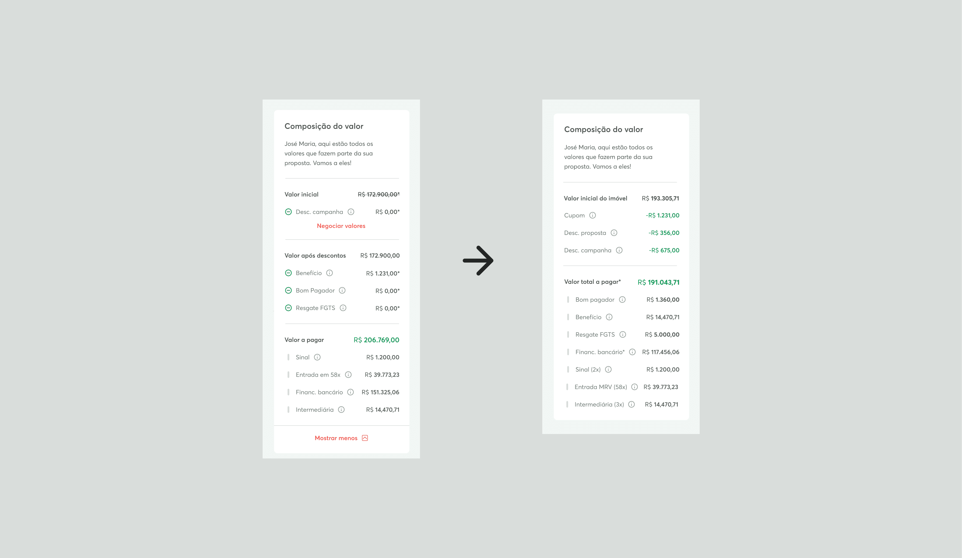
Clarity of values
Reorganized fields following more familiar mental models (such as e-commerce);
Visually emphasized key values like total cost and down payment;
Added tooltips and FAQ links to explain technical terms in context.
Improved communication
Standardized language and visual hierarchy;
Removed unnecessary or conflicting fields, including those showing zero values;
Improved layout structure for better readability and scanning.
Throughout the project, I was responsible for translating insights into solutions, creating high-fidelity prototypes, presenting proposals to the team and stakeholders, validating flows through additional testing, and monitoring the implementation and feedback post-launch.

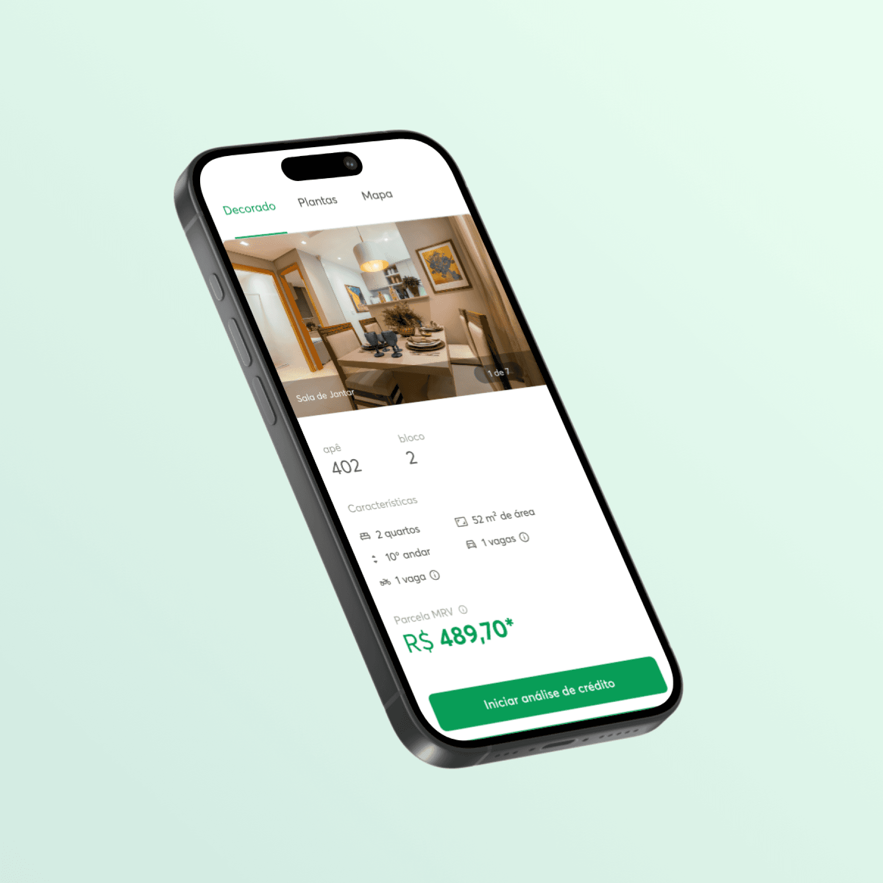
Making the layout more accessible and prioritizing the hierarchy of information.
Simplifying the visualization of information and bringing familiarity to the way of reading.

Highlighting an important field and inserting the FAQ.
Results & Business Impact
|
|
|
Beyond immediate results, the project also unlocked broader strategic developments. The insights revealed new opportunities to improve the negotiation experience and increase broker autonomy, while also laying the groundwork for more complex initiatives that would have required far more effort without this foundation.
———
*For privacy reasons, some data has been hidden and parts of the process have been condensed to highlight the key points. Want to know more? Feel free to get in touch!